TL;DR
The best Google Fonts for web design in 2026 are Inter, Space Grotesk, Poppins, Work Sans, Sora, and IBM Plex Mono. All six are free, open-source, and built to hold up on screens of every size. Keep reading for a breakdown of what makes each one worth using, plus some pairing ideas to get you started.
Fonts can completely change how a website feels. A playful rounded typeface makes a site feel warm and approachable, while a clean geometric sans-serif signals focus and professionalism. But choosing the right Google fonts for web design isn’t just an aesthetic decision, it’s a usability one too. The fonts you pick affect how easy the content is to scan, how long visitors stay on the page, and whether the overall design just feels right. The good news is you don’t need a premium type budget to get there. Google Fonts has a massive library of free, open-source options that work beautifully on modern sites, and these six are the ones worth reaching for in 2026.
Why designers keep coming back to Google Fonts for web design
Before getting into the list, it helps to understand why Google Fonts keeps showing up in professional work. Every typeface in the library is free and open-source, which means no licensing complications for you or your clients. (If font licensing is something you want to understand more deeply, this post on font licensing for designers breaks down the key things you need to know before handing off a brand.) Google also hosts these fonts on their own infrastructure, so they load quickly and consistently across browsers and devices. And a growing number of options in the library now support variable font technology, meaning a single file covers a continuous range of weights without adding extra load time.
Not every font in the library is worth using, but the ones below have earned their place through real-world performance across a huge range of site types.
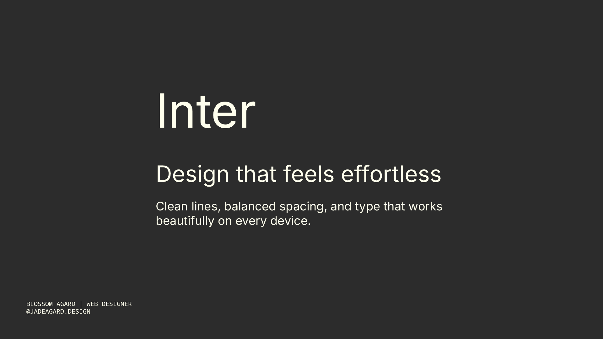
Inter is one of those Google fonts for web design that has become almost synonymous with well-built websites. Rasmus Andersson designed it specifically for digital interfaces, which shows in every detail: the tall x-height, the clean letterforms, the way it stays crisp at small sizes on any screen resolution. It’s not trying to add personality to your design, and that’s exactly what makes it so useful.
Reach for Inter when clarity is the priority. It works beautifully as a body font, but it holds up just as well at larger display sizes if you want to keep your font count to one. Portfolio sites, SaaS products, editorial blogs, most projects benefit from Inter somewhere in the typographic system.
Best for: Portfolios, SaaS and product sites, blogs, and any project where readability does the heavy lifting.

Space Grotesk is geometric in structure but has just enough irregularity in its letterforms to give it real character. That combination makes it one of the most effective Google fonts for web design when you need headers that command attention without being loud about it. It reads as forward-thinking and modern, which is why it keeps appearing on startup sites, tech platforms, and creative agency pages.
It pairs really well with a neutral, clean body font like Inter or Work Sans, so the personality lives in the headings while the copy stays easy to move through. If you need a font that makes an above-the-fold section feel confident and current, Space Grotesk earns that spot in 2026.
Best for: Hero sections, headings, navigation, and tech-forward or creative sites that need typographic personality.

Poppins is probably the most-used Google font for web design right now, and it’s easy to see why. The rounded geometry gives it that friendly, approachable quality that works across a wide range of brand types. Creative businesses, wellness practices, coaches, lifestyle brands, e-commerce stores, they all reach for it because it sits in a sweet spot between modern and accessible.
What makes Poppins especially practical is the weight range available. You can go from a thin 100 weight all the way up to extra-bold 800, which gives you everything you need to build typographic hierarchy without pulling in a second font. That kind of versatility is genuinely rare in a single typeface. If you’re ever stuck on which Google font to use for a site and nothing else is clicking, Poppins is a reliable default that rarely looks out of place.
Best for: Creative studios, lifestyle brands, wellness businesses, and any project that should feel approachable and modern.

Work Sans is one of those understated Google fonts for web design that makes everything around it look more considered. It’s clean and balanced without tipping into boring, and it was originally designed with display sizes in mind, so there’s a natural elegance to it at larger scales. It also holds up well in body copy and performs particularly well on mobile screens.
If you’re designing something minimalist or editorial, Work Sans fits that context without drawing attention to itself. It won’t add personality where none was asked for, but it will make the design feel polished and intentional. That kind of quiet competence is exactly what minimal brands are looking for.
Best for: Minimalist brand sites, editorial layouts, and brands with a clean, restrained aesthetic.
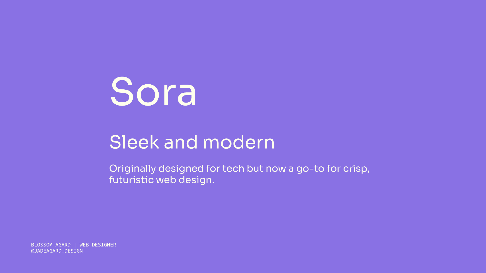
Sora is probably the least recognized font on this list, which is part of why it’s worth knowing about. Most Google fonts for web design that pick up momentum tend to feel overused within a year or two, but Sora has stayed relatively niche despite being genuinely good. The letterforms are clean and modern with a quiet warmth to them, so it feels fresh without reading as cold or clinical.
If you’re working with a creative or lifestyle brand that wants to feel more distinctive online, Sora is a strong option. It adds character without being distracting, and because it’s less widely used than Poppins or Inter, there’s a better chance it won’t look familiar to your client’s audience.
Best for: Creative studios, lifestyle and wellness brands, and projects where the client wants their site to feel individual.

Monospace fonts have been trending in web design for a while, and IBM Plex Mono is the best free option in the category. It has a techy, editorial confidence that makes it work beautifully as a typographic accent, short labels, navigation items, section tags, dates, or a single punchy line in a hero section.
The key to using this one well is restraint. Pair it with a clean sans-serif for the rest of the page and it becomes one of the most distinctive choices you can make with Google fonts for web design. Push it into body copy and it becomes genuinely difficult to read at length. A little goes a long way, but when it’s used right, the contrast it creates is hard to beat.
Best for: Tech brands, wellness sites going for a modern editorial feel, and any project that could use a confident typographic accent.
If you’re presenting your font choices and full brand system to a client, the Brand Guidelines Template gives you a dedicated space to document your typography, color palette, logo usage, and everything else in between. Available in Adobe Express, InDesign, Illustrator, and Affinity.
How to pair Google fonts for web design
Picking fonts individually is one part of the job. Pairing them in a way that actually works is where the design comes together.
The most consistent rule across good Google fonts for web design pairings is to keep it to two. One for headings, one for body text, with weight variations building the hierarchy within each. Pulling in a third font almost always makes a page feel scattered, even when each individual typeface is a strong choice on its own.
A few pairings that work well from this list: Space Grotesk for headings with Inter for body text gives you personality in the headers and total clarity in the copy. If you want to keep things consistent, Poppins can function as a single-font system across heading and body roles when you let the weights carry the visual hierarchy. And IBM Plex Mono used sparingly as an accent alongside Work Sans for body creates an editorial, minimal feel that suits creative and tech-adjacent brands particularly well.
Before you finalize any font pairing for a client project, check it on mobile. Some fonts that look great at desktop sizes become harder to scan when the viewport shrinks, and with mobile traffic accounting for such a significant share of web browsing in 2026, testing on smaller screens isn’t optional.
When it comes to documenting your font choices and handing everything off to your client in a way they’ll actually understand and use correctly, this post on what every brand guide should include covers everything that should go into your typography section and beyond.
Final Thoughts
The best Google fonts for web design in 2026 are all sitting right there in a free library, waiting to be used intentionally. Inter, Space Grotesk, Poppins, Work Sans, Sora, and IBM Plex Mono each have a distinct role depending on the kind of site you’re building and the brand personality you’re shaping. Start with the font that fits the project, pair it with one complementary choice, test it at mobile sizes, and resist the urge to keep adding to the mix.
Your clients’ sites will look better for it, and y’all know that’s the whole goal.
If you’re ready to present your font system as part of a polished, professional brand handoff, the Brand Guidelines Template is built to make that process feel easy. Available in Adobe Express, InDesign, Illustrator, and Affinity, it gives you a clean, structured way to document every typographic decision so nothing gets lost after delivery.
Frequently Asked Questions
What are the best Google Fonts for web design in 2026?
The top picks for 2026 are Inter, Space Grotesk, Poppins, Work Sans, Sora, and IBM Plex Mono. All six are free, screen-optimized, and versatile enough to work across different website types and brand personalities.
Are Google Fonts free to use on commercial websites?
Yes. Google Fonts are released under open-source licenses, primarily the SIL Open Font License (OFL) and the Apache License 2.0. That means you can use them on client websites and commercial projects without paying any licensing fees.
How many Google Fonts should I use on one website?
Two is the sweet spot: one for headings and one for body text, with weight variations used to build hierarchy. Using more than two fonts tends to make a website feel inconsistent and harder to navigate visually.
What is the best Google Font for website body text?
Inter is the most widely recommended option for body text because it was specifically designed for screen readability. Poppins and Work Sans are also strong choices depending on the brand’s personality.
What's the difference between a display font and a body font?
A display font is designed for large sizes like hero headings and section titles. A body font is optimized for readability at smaller sizes where visitors are reading full sentences and paragraphs. From this list, Space Grotesk and IBM Plex Mono work best as display or accent fonts, while Inter, Poppins, and Work Sans are reliable across both roles.
Do Google Fonts slow down websites?
They can add a small amount of load time if implemented without care. To keep performance strong, only load the specific weights you’re actually using, and look for variable font versions where available (Inter is one option that has a variable font available). Self-hosting your Google Fonts is another approach worth considering for performance-focused projects.